


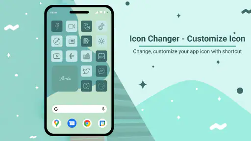
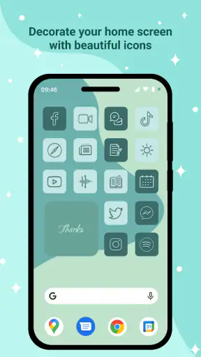
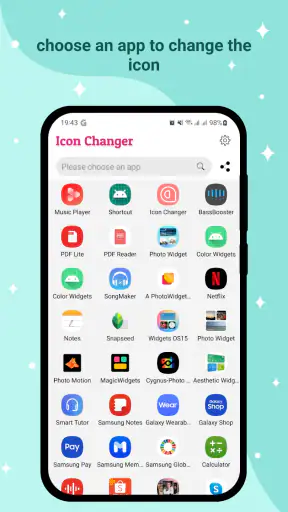
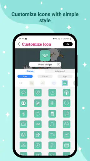
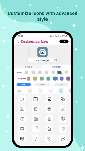
I noticed Icon Changer - Customize Icon because it tackles one of those small Android annoyances that is easy to overlook: the default app icons can make a carefully chosen home screen feel unfinished. After spending time with it, I found that its appeal is immediate. It is a personalization app from ambi mx that lets me replace ordinary app icons with custom artwork, so the home screen can match a color scheme, wallpaper, mood, or broader phone theme.
The first impression is positive because the idea is simple to understand. I do not need to learn a complicated design system before seeing a result. I can choose an app, select a custom icon, and make a visible change to the launcher. That directness is the main reason the app has attracted over a million installs and a 4.6 average from around twenty-three thousand ratings. Those figures do not make it perfect, but they do suggest that the basic promise is easy for many people to appreciate.
What the first week feels like
During the first week, the fun comes from experimenting. I can start with the apps I look at most often rather than trying to redesign everything at once. Messaging, music, camera, browser, and calendar icons usually sit in the most visible places, so changing those gives the home screen a new personality quickly. This is a better approach than spending a long session replacing every icon and then discovering that the result feels too busy.
I especially like the control this gives people who care about visual consistency. A wallpaper may use muted colors while the default icons use bright, unrelated tones. Custom replacements can make the screen feel calmer. Someone who prefers a monochrome look can also use the same general style across frequently used apps. The benefit is not about making the phone faster; it is about reducing visual noise every time I unlock it.
There is also a useful psychological side to the first setup. A redesigned home screen can make an old phone feel less stale without changing the device itself. That makes the app more interesting than a novelty filter or a temporary wallpaper. The change appears in a place I visit repeatedly, so even a modest visual adjustment can feel surprisingly personal.
Still, I would not recommend changing everything immediately. A home screen is also a navigation tool, and familiar icon shapes help me find an app without thinking. If every symbol becomes unfamiliar, the visual improvement may come at the cost of speed. My practical method is to customize one row or one group at a time, then use the phone normally for a day before deciding whether the new arrangement is genuinely helpful.
Choosing a style that remains usable
The best results come from treating custom icons as part of a system rather than collecting attractive images individually. Before replacing anything, I would decide whether the goal is soft colors, bold contrast, a dark look, or a simple matching set. An icon that looks beautiful on its own may clash with the neighboring icons, and a low-contrast design can make an important app harder to recognize.
I also recommend keeping high-priority apps visually distinct. If the phone is used for work, travel, family communication, or accessibility needs, recognition should come before decoration. I can reserve the most experimental designs for less urgent apps while leaving essential tools easy to identify. That trade-off is one of the differences between a home screen that looks good in a screenshot and one that remains comfortable after weeks of daily use.
Another practical tip is to photograph or note the original layout before making major changes. This is not exciting, but it makes reversing a failed experiment much easier. I have found that customization sessions often begin with one change and turn into several rearrangements. A simple record prevents the process from becoming frustrating if I later decide the original placement was more efficient.
Where it fits among the usual alternatives
Android already offers several ways to personalize a device, including wallpapers, widgets, launcher settings, and complete icon packs supported by some launchers. Those alternatives can be better when I want a broad, coordinated redesign or deeper control over spacing, gestures, folders, and the overall grid. A launcher is the stronger choice for someone who wants to rebuild the entire home-screen experience.
This app makes more sense when I want a narrower change without committing to a new launcher. It focuses on the icons themselves, which can be less intimidating for someone who likes the current layout and only wants to alter its appearance. That focused approach is also its limitation: users looking for extensive launcher behavior, advanced grid controls, or a complete interface replacement should look elsewhere.
Compared with leaving the phone untouched, the advantage is obvious. Compared with a full launcher overhaul, the advantage is restraint. I can make the phone feel more personal while keeping most of the habits I already have. For me, that middle ground is the strongest reason to try it.
Does the novelty survive from month to month?
After the first burst of excitement, the important question changes. It is no longer whether a custom icon looks different, but whether that difference continues to improve the daily experience. In my view, the answer depends on how often I care about the home screen and whether the chosen style supports quick recognition.
For someone who enjoys seasonal themes, color changes, or regular visual refreshes, the app can remain useful. A home screen can be adjusted when the wallpaper changes, when a new phone case inspires a different palette, or when a person wants a cleaner arrangement for a new routine. The app has recurring value in those situations because it supports small, manageable updates instead of forcing a complete redesign.
For someone who sets up a phone once and rarely looks at personalization again, the value will probably decline after the initial session. Once the icons are changed, there may be no reason to return until the user wants another style. That is not a flaw in the basic concept, but it does mean the app earns long-term space mainly through continued interest in customization rather than through a daily functional task.
I think the strongest recurring use case is organization by context. I might create a calmer arrangement for a work-focused period, a brighter look for personal use, or a visually simple layout when I want fewer distractions. The icons do not create those routines by themselves, but they can reinforce them. A carefully chosen appearance can act as a small reminder of what the current home screen is meant to help me do.
Practical questions about everyday use
A common concern is whether the app is suitable for a casual user. I would say yes, provided that user wants to change individual app appearances rather than redesign the entire phone. The concept is approachable, and the free price makes trying it low-risk. The content rating is Everyone, so it is positioned for a broad audience rather than a niche group of advanced Android enthusiasts.
Another question is whether it replaces a launcher. It does not occupy the same role in my workflow. I see it as a focused personalization tool, while a launcher changes how the home screen behaves and how apps are organized. If the current launcher already feels comfortable, Icon Changer can be the less disruptive route. If the launcher itself is the problem, changing icons alone will not solve it.
People also wonder whether the free version is enough for a meaningful experiment. The app is free to download and use, while in-app purchases are listed at $3.99 per item. I would begin with a limited redesign and decide whether the available customization fits my needs before spending anything. That approach is sensible because the usefulness is personal: a user who only wants a few visual changes may have a different experience from someone planning a complete themed setup.
Compatibility is another straightforward consideration. The listed minimum is Android seven point zero, so it is aimed at a wide range of Android devices rather than only recent phones. Even so, the exact feel of icon customization can depend on the device’s launcher and Android interface. I would test the workflow on the phone I actually use instead of assuming that every manufacturer handles home-screen changes in exactly the same way.
The maintenance cost people notice later
The hidden cost of a customized home screen is maintenance. An icon replacement is not the end of the process if the app is uninstalled, the launcher is reset, the phone is restored, or the layout is reorganized. I would keep expectations realistic: customization can look effortless once finished, but restoring a familiar setup later may require attention.
This is where the app can lose some of its appeal for people who change phones often. A carefully arranged screen may need to be rebuilt on a new device, and the time spent choosing icons can feel less worthwhile if the setup is temporary. The same issue applies after a major reset. Before investing in a full redesign, I would take screenshots and keep a short note of which apps were changed and where they belonged.
Maintenance also appears when I add new apps. A new installation may arrive with its ordinary icon while the rest of the home screen follows a custom style. That mismatch can be harmless, but it may tempt me into another round of adjustments. The more demanding the visual theme, the more likely I am to notice small inconsistencies and spend time correcting them.
For that reason, I prefer a selective setup. Customizing the most visible apps gives much of the visual benefit while keeping future upkeep manageable. A complete replacement can be rewarding for a dedicated enthusiast, but it creates more opportunities for the design to drift as the phone changes.
Where fatigue starts
The first source of fatigue is recognition. If custom artwork is too abstract, I may hesitate before opening an app I used to identify instantly. This matters most when I am in a hurry. A beautiful design that slows down common actions is not a successful improvement in my book.
The second is inconsistency. Some icons may match perfectly while others use a different visual language. Instead of making the screen feel intentional, the mixture can make it look unfinished. The solution is not necessarily to customize every app; it is to choose a smaller group that can share a clear style and leave the rest in places where they are less visually prominent.
The third is the temptation to keep adjusting. Personalization apps can turn the home screen into a project. I might spend more time comparing styles than benefiting from the result. Setting a simple stopping rule helps: change the important icons, use the phone for several days, and only continue if the changes improve recognition or enjoyment rather than merely creating another task.
There is also a financial consideration for users who want to keep expanding their collection. The listed in-app purchase price is $3.99 per item, so repeated purchases can matter more than a single trial. I would judge each purchase by how often I expect to use the result, not by the excitement of a one-time makeover. Someone who wants an occasional refresh may be comfortable with that model, while a person seeking unlimited experimentation should compare the cost with a broader icon-pack or launcher solution.
Who should keep it installed?
I would keep this app installed if I regularly care about the look of my phone, enjoy matching icons to wallpapers, or want a personal touch without replacing my launcher. It is also a good fit for someone who wants to refresh an older device and prefers a focused tool over a complicated customization suite.
I would be more cautious if I depend on instant icon recognition, dislike maintaining visual systems, or rarely change the home screen. In those cases, the novelty may fade quickly. A standard launcher with a well-organized layout could be more useful, and a complete icon pack may offer better value for someone who wants a coordinated set rather than individual changes.
The app is also not the right answer for every kind of personalization. It will not turn a basic home screen into a productivity system by itself, and it should not be judged as a replacement for widgets, automation, or launcher controls. Its job is narrower, and I think it works best when I let it remain narrow.
Version 1.4.1 is the version I would look for when installing it, and the developer behind it is ambi mx. The app’s 397 reviews and broad rating history add confidence that it has been used by a substantial audience, but I would still evaluate it based on my own launcher and habits. Personalization is unusually dependent on context, so a highly rated visual tool can still feel unnecessary to someone who prefers the default interface.
My long-term verdict
My lasting opinion is favorable, with one condition: use it deliberately. The first-week appeal is real because changing icons produces an immediate, visible result. The month-to-month value is more selective, appearing when I enjoy refreshing themes or using visual organization to support different routines. It is not an app I would expect everyone to open every day, but it can justify its place when personalization is part of how someone enjoys their device.
The most convincing strategy is to customize the apps that matter most, preserve recognition for essential tools, and avoid turning the home screen into a permanent maintenance project. That approach captures the benefit while limiting the fatigue caused by mismatched icons, new installations, and future resets.
My recommendation is to try it as a focused makeover tool, not as a complete phone-management solution. The free entry point makes experimentation easy, the Everyone rating keeps it broadly approachable, and the Android seven point zero minimum covers many existing devices. Just remember that the visual change is only valuable if it still feels convenient after the excitement wears off. For people who want a calmer, more personal home screen while keeping their familiar launcher, Icon Changer earns a place. For users who want deep interface control or never revisit their phone’s appearance, the usual launcher and icon-pack alternatives may be the better long-term choice.


